Online Magazine
Recent Posts
- Safeguard your Cellphone Photos
- Black & White to Color – Instantly
- Wearing Many Hats
- Video Roundup
- Rescuing Your Blurry Pictures
- Showing Their Age
- What is Your Angle?
- Panorama Photos
- Humorous Photos
- Close Ups
- Fisheye Pictures
- Photo Antiquities
- Printing Big
- Appreciating Scale
- Celebrity Sightings
Tags
More Places to Go
- Free "How-To" Books “How To” books for popular cameras 0
- Vist Us on Facebook keep in touch with us on Facebook 2
Archives
- July 2023 (1)
- March 2023 (2)
- February 2023 (1)
- December 2022 (1)
- October 2022 (1)
- September 2022 (8)
- August 2022 (9)
- July 2022 (1)
- June 2022 (1)
- June 2021 (1)
- May 2021 (1)
- March 2021 (5)
- February 2021 (4)
- January 2021 (2)
- April 2019 (1)
- March 2019 (1)
- February 2019 (1)
- October 2018 (2)
- April 2018 (1)
- March 2018 (4)
- February 2018 (1)
- November 2017 (1)
- August 2017 (1)
- June 2017 (1)
- April 2017 (1)
- March 2017 (5)
- February 2017 (2)
- January 2017 (1)
- October 2016 (1)
- September 2016 (1)
- August 2016 (1)
- July 2016 (1)
- May 2016 (1)
- April 2016 (1)
- March 2016 (2)
- February 2016 (1)
- January 2016 (2)
- December 2015 (1)
- November 2015 (1)
- October 2015 (3)
- April 2015 (1)
- March 2015 (5)
- February 2015 (1)
- January 2015 (4)
- December 2014 (2)
- November 2014 (5)
- October 2014 (2)
- September 2014 (1)
- August 2014 (2)
- July 2014 (1)
- May 2014 (1)
- April 2014 (5)
- March 2014 (5)
- December 2013 (2)
- November 2013 (18)
- October 2013 (1)
- September 2013 (1)
- August 2013 (1)
- July 2013 (1)
- June 2013 (3)
- May 2013 (1)
- April 2013 (2)
- March 2013 (1)
- February 2013 (1)
- January 2013 (1)
- December 2012 (1)
- November 2012 (2)
- October 2012 (2)
- September 2012 (5)
- August 2012 (2)
- July 2012 (1)
- June 2012 (1)
- May 2012 (1)
- April 2012 (4)
- March 2012 (1)
- February 2012 (1)
- January 2012 (3)
- December 2011 (1)
- November 2011 (3)
- October 2011 (1)
- September 2011 (2)
- August 2011 (2)
- June 2011 (3)
- May 2011 (4)
- April 2011 (8)
- March 2011 (8)
- February 2011 (10)
- January 2011 (6)
- December 2010 (11)
- November 2010 (14)
- October 2010 (6)
- September 2010 (12)
- August 2010 (2)
- July 2010 (4)
- June 2010 (3)
- May 2010 (1)
- April 2010 (1)
- March 2010 (2)
- February 2010 (1)
- January 2010 (1)
- December 2009 (1)
- November 2009 (2)
- October 2009 (2)
- September 2009 (1)
- August 2009 (3)
- July 2009 (2)
- June 2009 (1)
- May 2009 (2)
- April 2009 (1)
- March 2009 (2)
- February 2009 (1)
- January 2009 (3)
Black & White to Color – Instantly
27th March 2023
Not Quite Magic, But Amazing Nonetheless
Like many photography buffs, I subscribe to Adobe Creative Cloud that provides me a set of applications for editing my images. For all of the years that I’ve been using the computer for photography, I’ve never been a regular user of Photoshop. While I’ve used it on occasion I’ve instead relied on the company’s younger offspring Lightroom for most of my image editing.
As a subscriber I receive regular electronically delivered newsletters about Creative Cloud. A few weeks ago one of the articles drew my interest – colorizing black and white images.
Those of us who grew up taking pictures in the 1950s and 1960s have a large stash of black and white photos – and I have my share. I clicked on the article to find out more about this magical process.
The process involved using one of Photoshop’s built-in filters. Being a Photoshop novice I was unfamiliar with these filters so I had to dig deeper.
Well it turns out that I didn’t have to dig very much. The newsletter explained that the only thing I needed to do was to choose “Neural Filter” from Photoshop’s top menu and then click the “Colorize” button. Instantly – yes instantly – the black and white photo was converted to a color version.
The images are colorized using a best guess model that Adobe employs. The processing is not perfect but most of the images that I tried turned out acceptable. The few inconsistencies that I noticed did not detract from the overall results. And a few of the colorized images exceeded my expectations.
Below are a few of the B&W’s – including some of my favorites – that I was anxious to try.
|
|
|
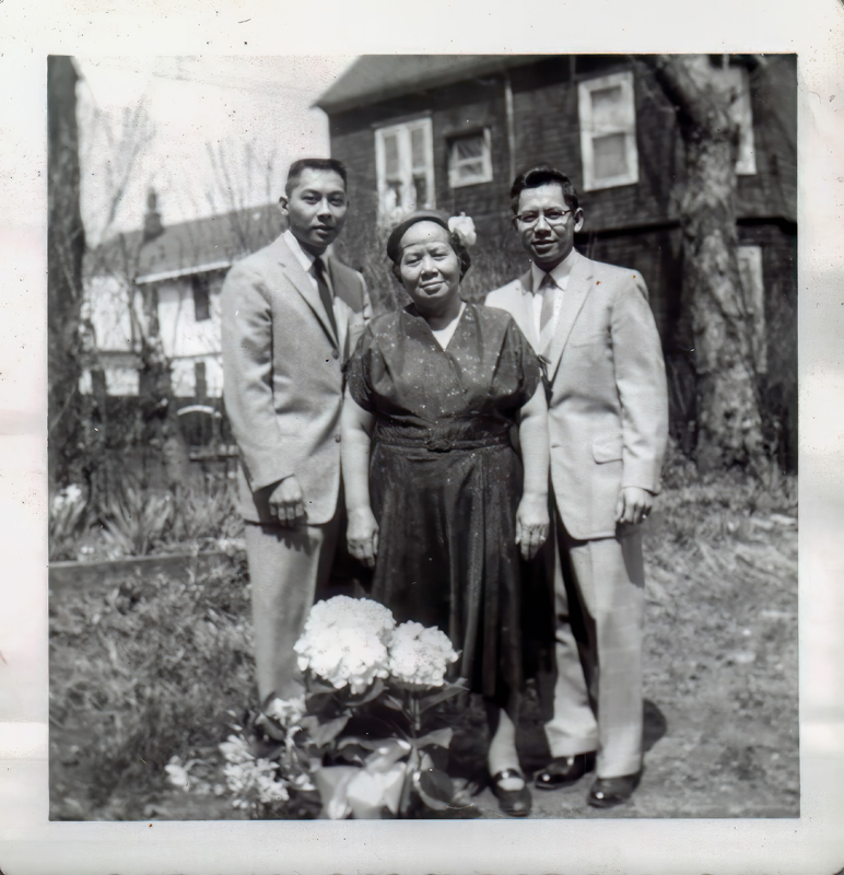 A photo of my Grandmother and two uncles taken in the 1950s. |
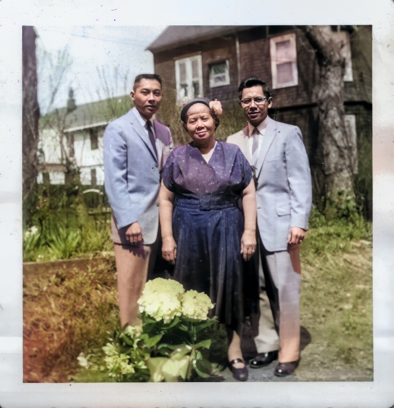 The colorized version fails to maintain consistent color of the suits. |
|
|
|
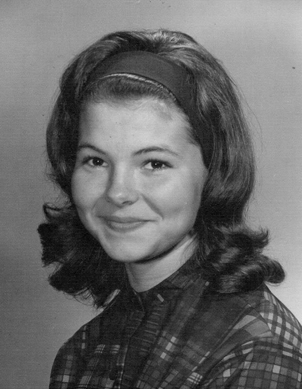 A high school photo of a student from the 1960s. |
 The colorized version is good except the student didn’t use lipstick. |
|
|
|
 Writer William F Buckley lecturing at the Univ of Michigan in 1969. |
 Above you will notice that the background does not maintain the same color. |
|
|
|
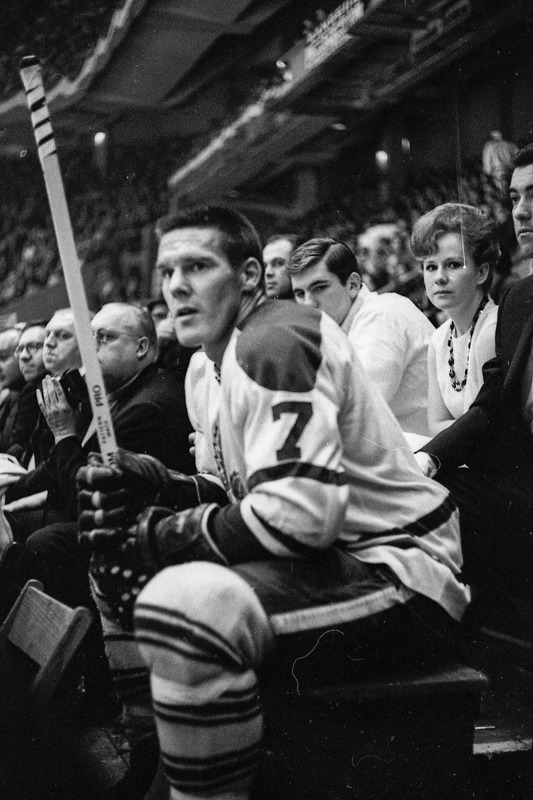 Hockey star Tim Horton sitting in the penalty box at Madison Square Garden about 1964. |
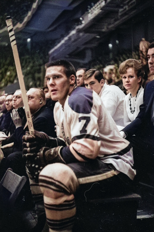 The color processing chose blue for Tim’s jersey which happens to be the color of the Toronto Maple Leaf uniform. Good guess. |
|
|
|
 Singer Ron Townsend of the Fifth Dimension performing in Ann Arbor in 1970 |
 An amazing transformation. I don’t know if the colors are accurate to his 1970’s outfit but they appear authentic. |
|
|
|
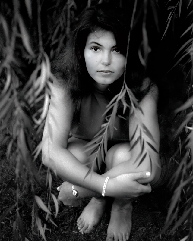 A snapshot of my wife while we were enjoying nature and the outdoors in 1969. |
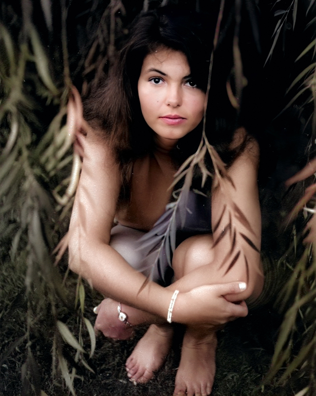 Photoshop’s choice of colors is less important to me than the warm feeling that I receive from the colorized photo. |
|
|
|
|
|
|
I’m still excited when I find another older black & white photo that I can colorize.
Written by: Arnie Lee
Do you trust your monitor?
26th January 2011
Color Calibration with the Pantone Huey Pro
As photographers, we spend an extraordinary amount of time fretting over color. We carefully tweak the camera settings and adjust the white balance, ISO, raw quality, exposure, noise level and sharpness to produce magnificent color in the captured image. Afterwards, we transfer the digital film to our computerized darkroom for further processing with a goal of reproducing the colors as true to life as possible.
So why are we surprised (read: disappointed) when a prized photo looks so different from our mind’s eye view of the original scene? After all, haven’t we set the camera for the best color?
The reason may well be that the true color of the photo has been inexplicably changed by the computer monitor.
(more…)